Reporting Management Tool:
A UX Overhaul for Clarity and Control
A complete redesign of the report management tool to improve report discoverability, clarify report functions, and streamline scheduling. The project introduced a new landing page, search and filter capabilities, template management, and improved accessibility across devices. The redesign resulted in a 12% increase in usage, with over 1,200 reports generated compared to the previous year.

Before
UX Product Designer
I was responsible for conducting user research, analyzing data, prototyping to visualize insights, and designing the report management experience. I also mentored a new designer to help him understand the design standards.
Role
To B | Digital Transformation | Website Design | System Design
Results in a 12% increase in usage,
Over 1,200 reports were generated compared to the previous year.
Why we redesign the 15-year-old system?
The report generation system was originally built over 15 years ago for internal use, with employees manually generating reports for customers. As the business scaled, this model became increasingly unsustainable—requiring significant resources and labor to keep up with growing demand. To reduce operational costs and improve efficiency, the tool was recently opened to customers for self-service reporting. However, user feedback revealed that the system was too complex and unclear, prompting a full redesign to make it more accessible, intuitive, and scalable.
After

Impact
Project manager, Project lead, UX designers, Developers
Worked closely with stakeholders - Data analysts, Software engineers, and Content strategists.Item description
Team
What is the Report Management Tool?
The Report Management Tool helps users (internal users, businesses) generate, organize, and analyze reports. Originally for internal use, it now supports self-service reporting for customers. As an e-commerce platform, we help customers track software usage and hardware expenses, providing insights to manage budgets effectively. Additionally, parent companies use the tool to generate reports for subsidiaries, assisting with financial balance sheets and other business operations.
Background
Despite being powerful and flexible, the legacy report generation system was complex and unintuitive. Customers from various industries needed different report formats to match their internal systems, but struggled to identify the right reports—let alone manage them. This led to frequent reliance on internal support teams, increasing operational workload and reducing overall efficiency.
Problem: A trustable tool but with great complexity
The original request was to "just update the UI" — but deeper usability issues quickly surfaced.
User roles and needs were undefined, making it hard to design with clarity and purpose.
Customers lacked confidence in using the tool, often relying on support for report generation.
Challenge:
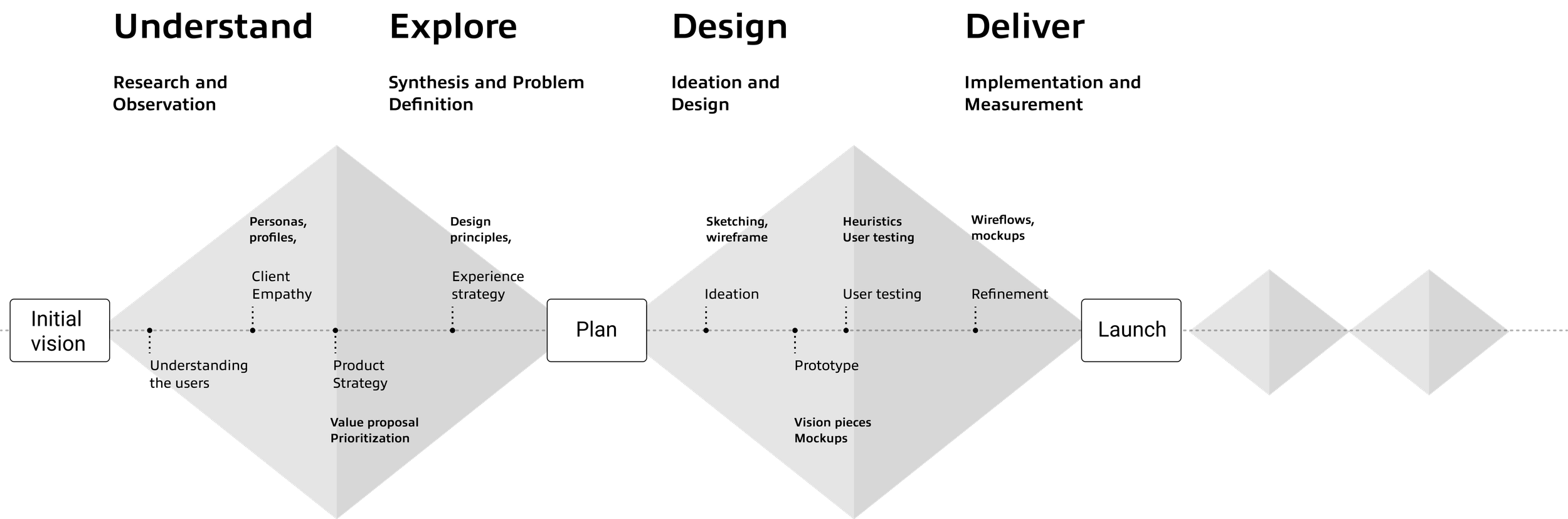
Design process
1: Sales Representatives -
Sales reps manage multiple clients and generate reports tailored to each client’s needs.
2: Customers -
Customers are businesses that use the platform to generate reports for software usage and budget planning.
Needs:
Need to quickly find the right report from thousands of options.
Need clear descriptions to match reports with client needs.
Need to manage reports efficiently for multiple clients.
Who are the stakeholders?
Before the project began, we developed key personas to help identify stakeholders and better understand the needs of different user groups.
Persona 1

Emily
Client Solutions Specialist
Generate and deliver customized reports for clients, ensuring they meet specific needs and expectations.
Persona 2
Needs:
Need help discovering the right report for tracking software usage and budgeting.
Need to schedule recurring reports with minimal setup.
Need flexibility to make changes (e.g., splitting report) without starting from scratch.
Phase 1: Understand
Prompt1:
"The variety of reports available can be overwhelming, and I often spend too much time figuring out which one fits our needs. Once I find the right report, I just need it to run consistently without redoing the process each time."
Prompt 2:
"Our reports are mostly stable, but we still need the ability to make minor adjustments, like splitting a report into separate ones for different products. It’s about getting the data we need, with as little hassle as possible."
Stakeholder Interview
Prompt 1
"I juggle multiple clients, and each one needs a tailored report. But with thousands of reports to sift through, it's often a challenge to find the right one quickly. I need a more intuitive system to help me get the job done faster and with less back-and-forth."
Prompt 2:
"Every time I send a report, I need to be confident it meets the client’s specific needs. The current tool doesn’t give me enough clarity, and I often waste time searching for the right report, which affects my ability to manage multiple accounts efficiently."
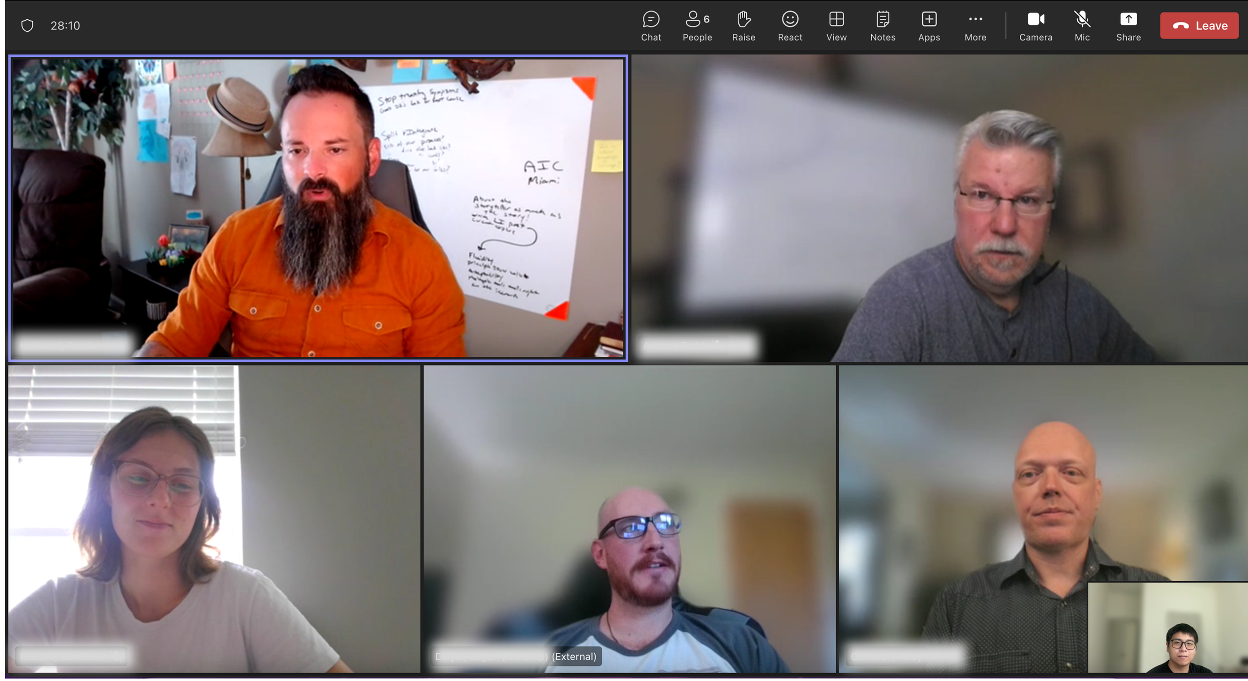
After identifying our key users, we invited both internal and external participants to ensure diverse perspectives across roles and use cases. We conducted user interviews and program demos to better understand how the tool was used in practice and to uncover pain points within the existing experience.

Rob
Business Operations Manager
Access, customize, and schedule reports to track software usage and support budget planning.
2: Confusing Account Identification
Users had difficulty identifying which account or product a report was tied to, especially when managing multiple clients or services.
User Research Insights
1: Endless Scrolling & Overload
Users struggled with scrolling through long, unorganized lists of reports, making it hard to locate what they needed efficiently.
4: Inflexible Scheduled Reports
Users couldn't edit, delete, or clearly see the reports they had scheduled—leading to confusion and unnecessary duplication.
3: Template Confusion & Redundancy
Users wanted to create reusable templates but didn’t understand how to use them. As a result, they repeated the same work multiple times.
6: Lack of Visual Clarity
The overall design didn’t support easy report discovery—users needed a clearer, more organized interface to navigate effectively.
5: Inconsistent Formats & Outputs
Reports varied in structure and presentation, making them hard to compare or use reliably across different needs.
Phase 2: Explore
UX Strategy
Empowering Confident Reporting Through UX
Based on these insights, we developed a focused UX strategy. Given the diversity in customers’ familiarity and attitudes toward reporting, our primary goal was to improve report management literacy by introducing a clear and structured report management journey. We believed that empowering users with the confidence to understand and navigate reporting would encourage them to manage their reports independently within our platform.
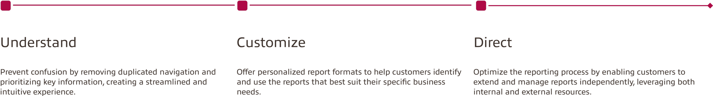
HMW Question
How might we build user confidence in navigating and managing reports within the digital space?
Customer User Journey
Instilling strategies into users' journey
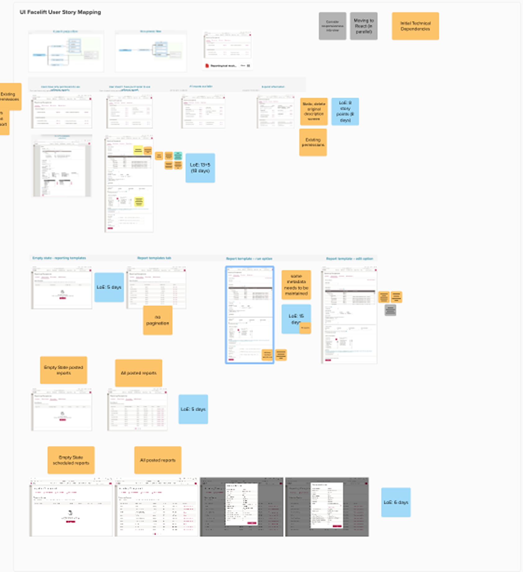
To concretize the strategy, we've generated features that will serve each strategy and mapped them on to the users' journey.

Ideation
We conducted a comparative usability test by presenting two prototype ideas to stakeholders. We observed how they interacted with each version and asked which one they preferred, helping us identify the more intuitive design.
Idea 1
Concerns with Idea 2:
Required excessive scrolling
Difficult to locate specific reports (especially with hundreds of entries)
Hard to scan and read long report descriptions
New User Flow & Side Menu
In the redesigned experience, we streamlined the journey into a single, clear flow that adapts to user needs while staying consistent across roles. The improved flow:
Consolidates access points into a unified starting page
Offers guided steps based on report type and user goals
Highlights saved templates and previously run reports
Clarifies scheduling, editing, and delivery options
Idea 2
Preferred Idea 1 for its:
Cleaner layout
Better readability
More modern visual design
Phase 3: Design
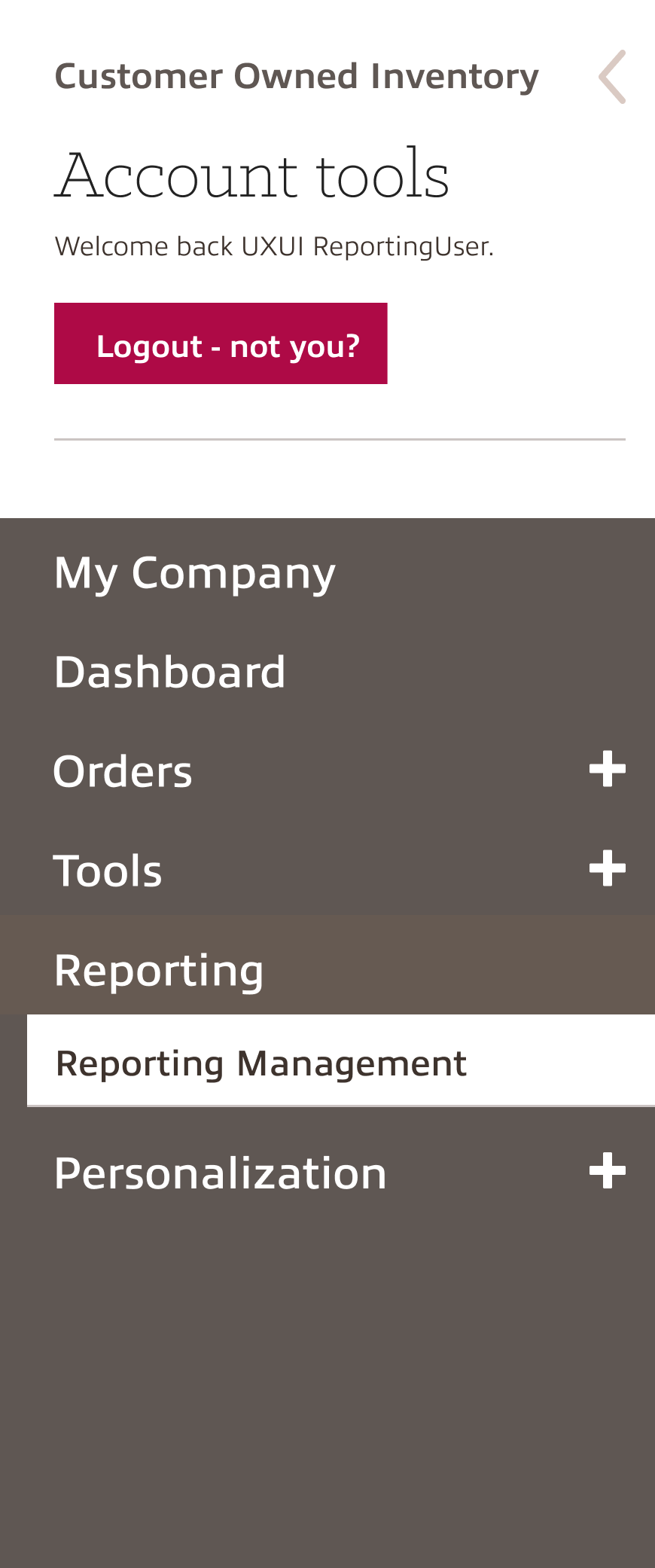
Current User Flow & Side Menu
The original experience presented users with multiple, inconsistent entry points to access reports. Sales reps, customers, and internal users each had their own informal paths, often relying on trial and error. This fragmented structure led to:
Confusion over which path was correct
Repetitive actions across different pages
Difficulty locating specific reports
Lack of standardization across user types

Phase 4: Final Delivery
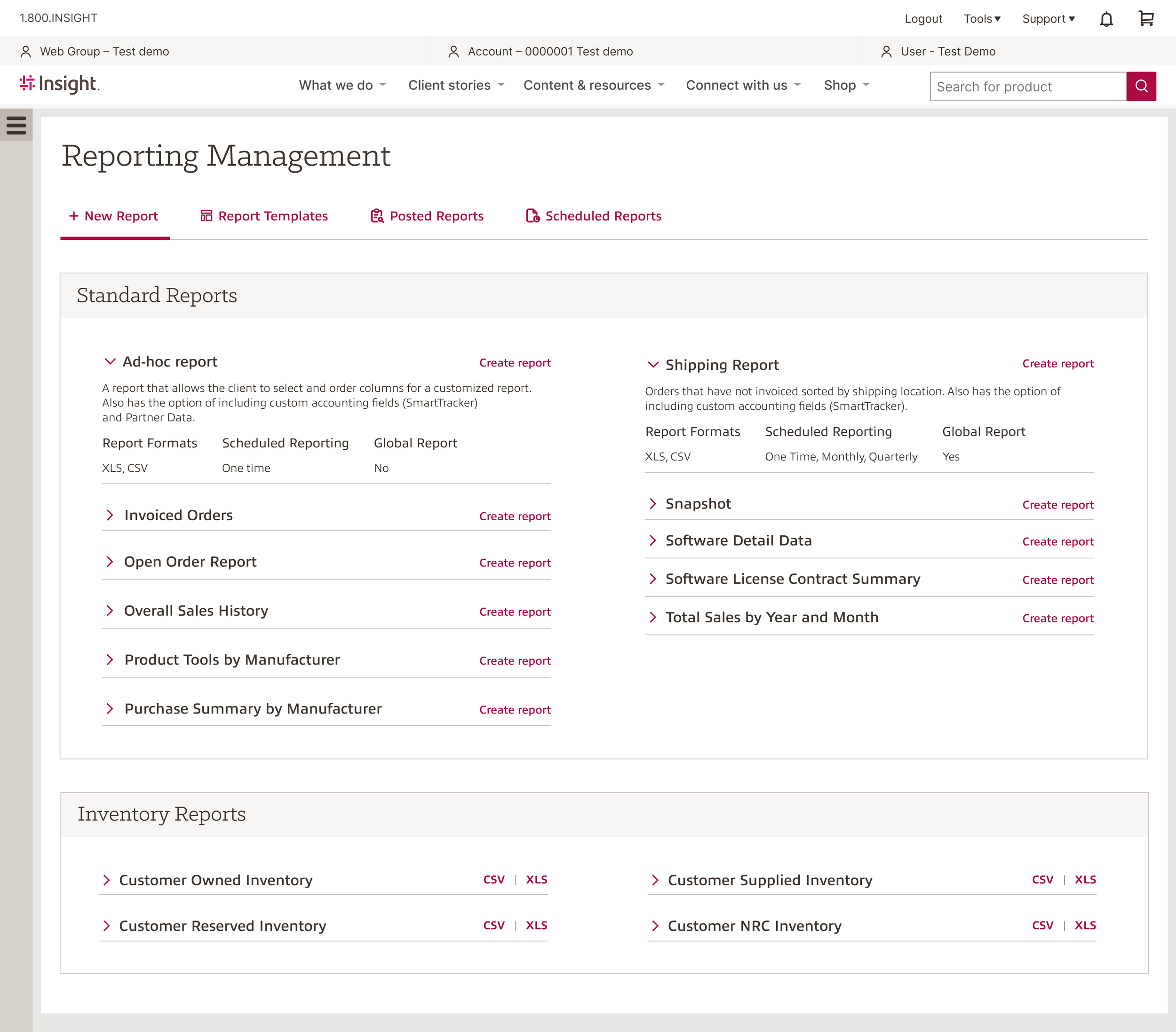
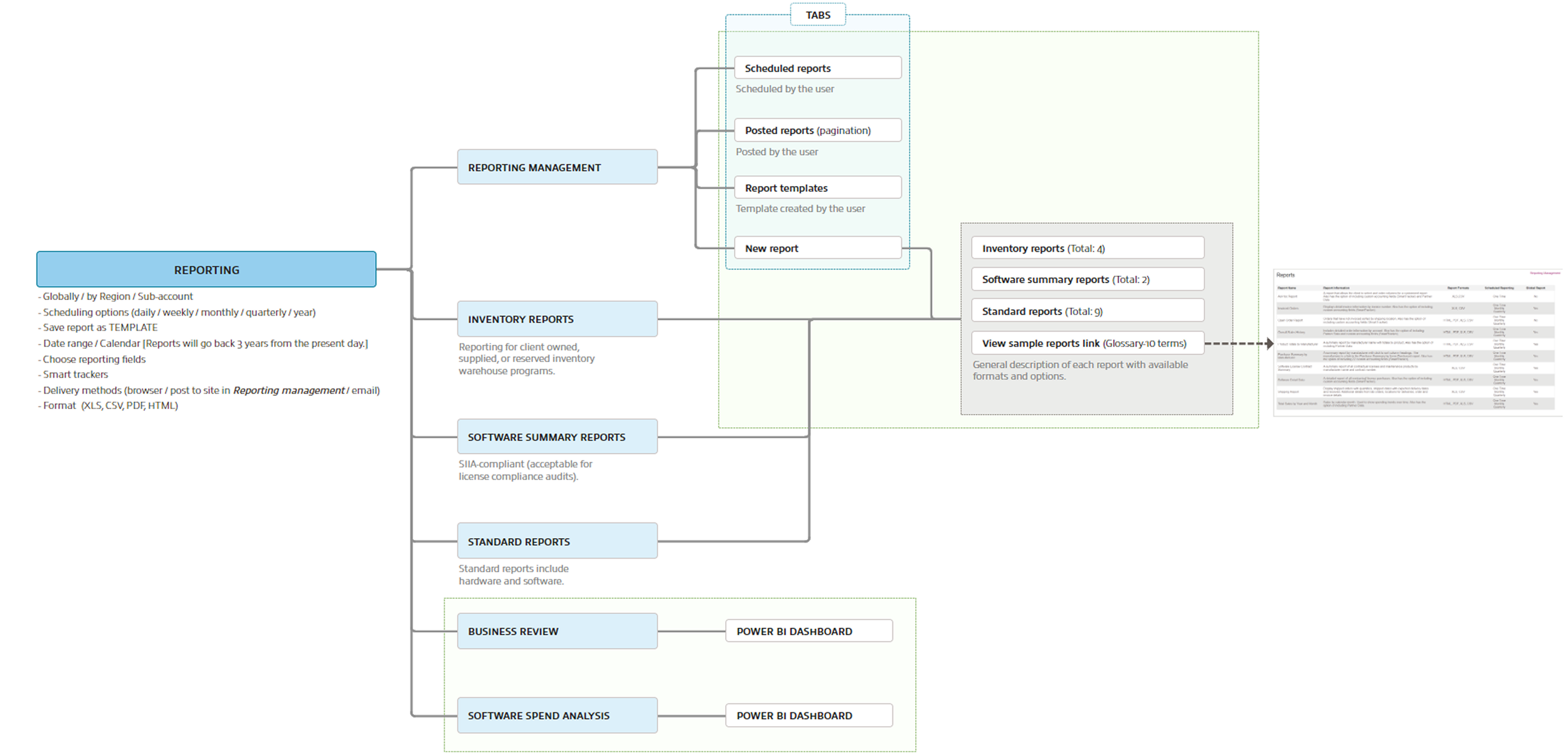
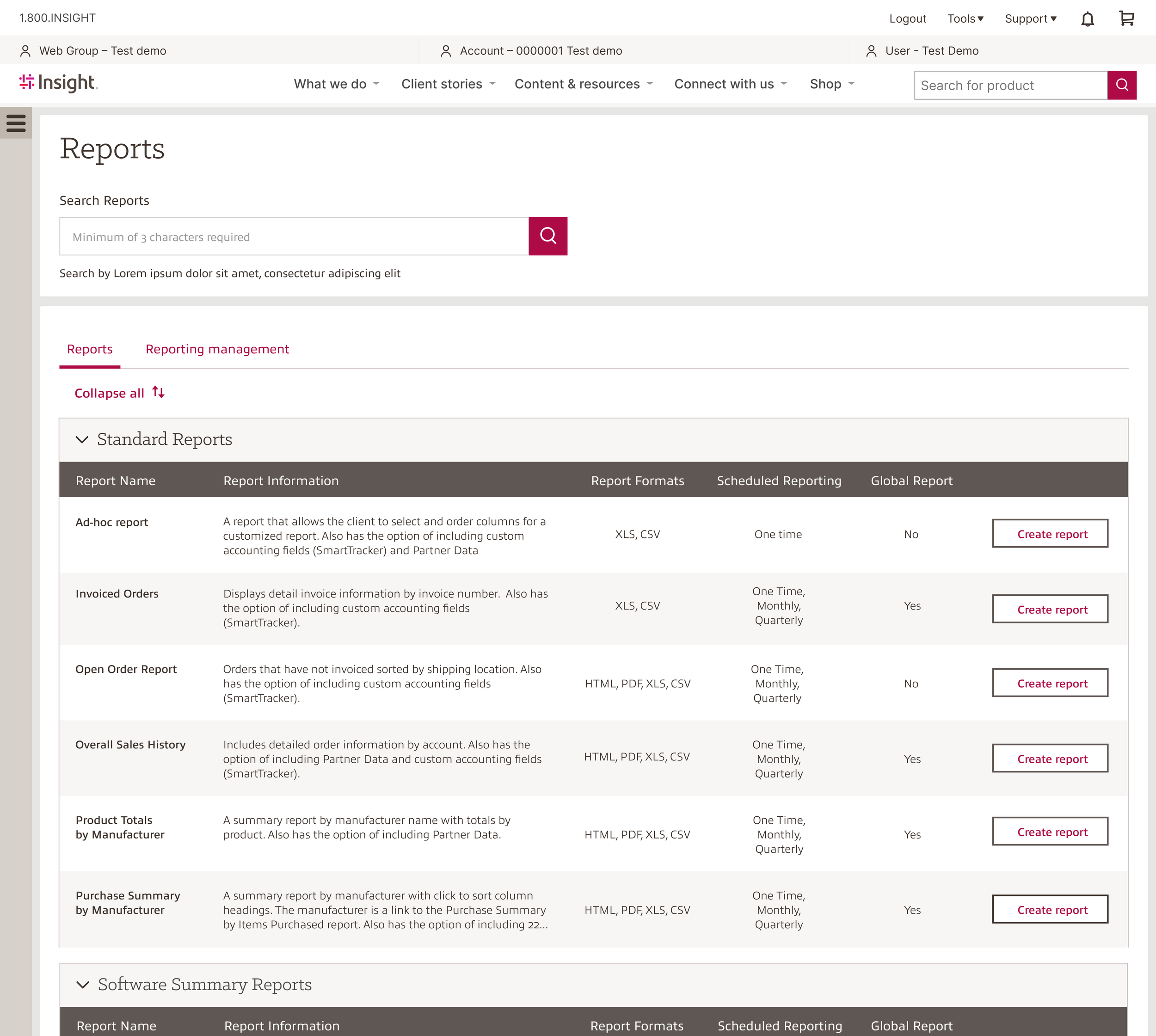
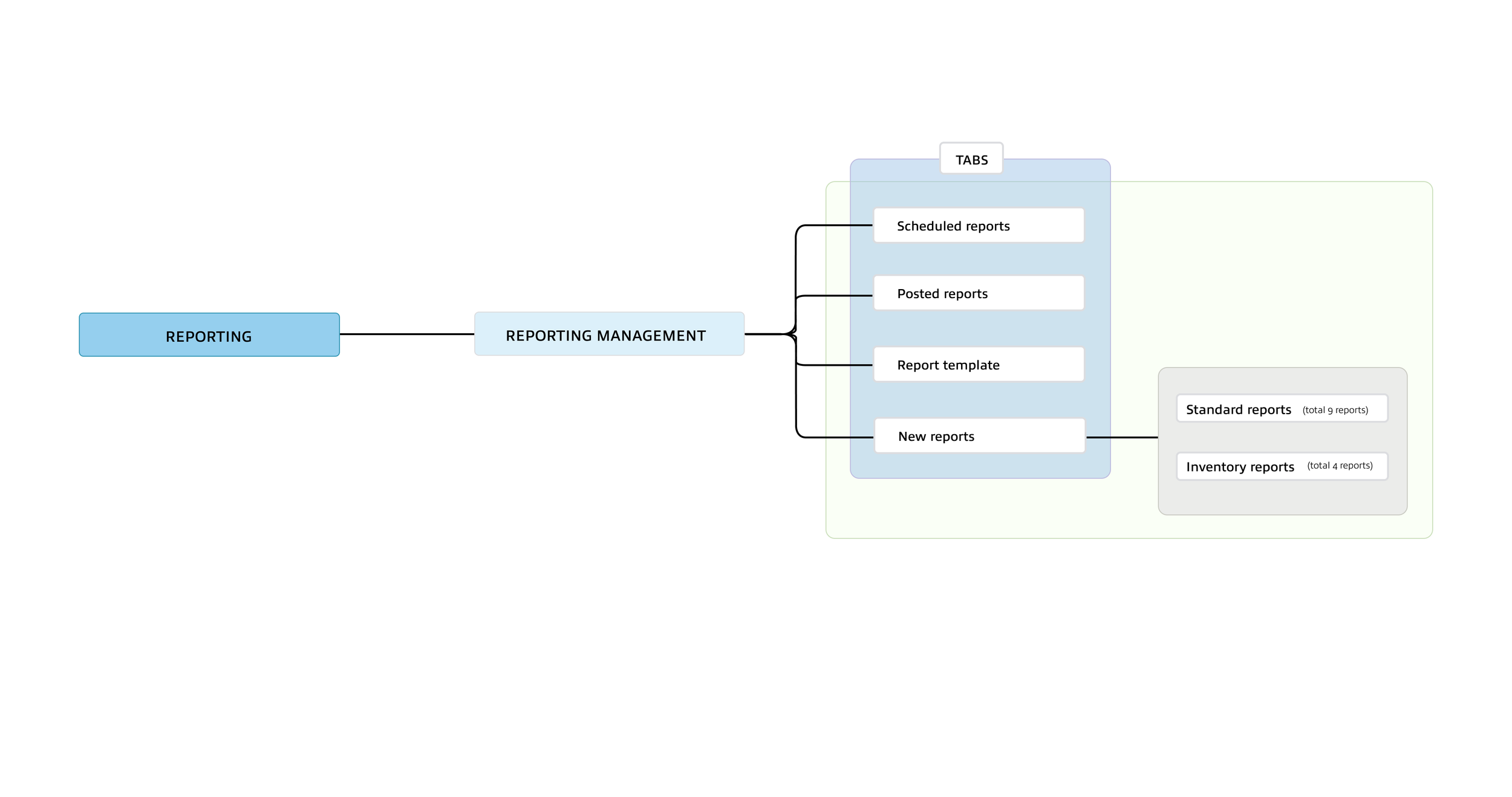
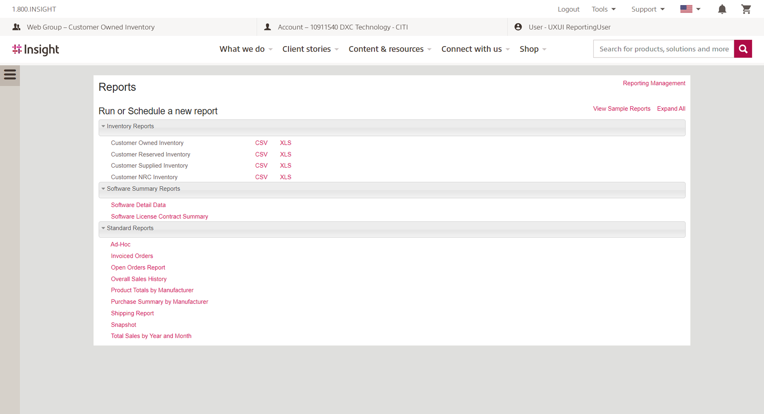
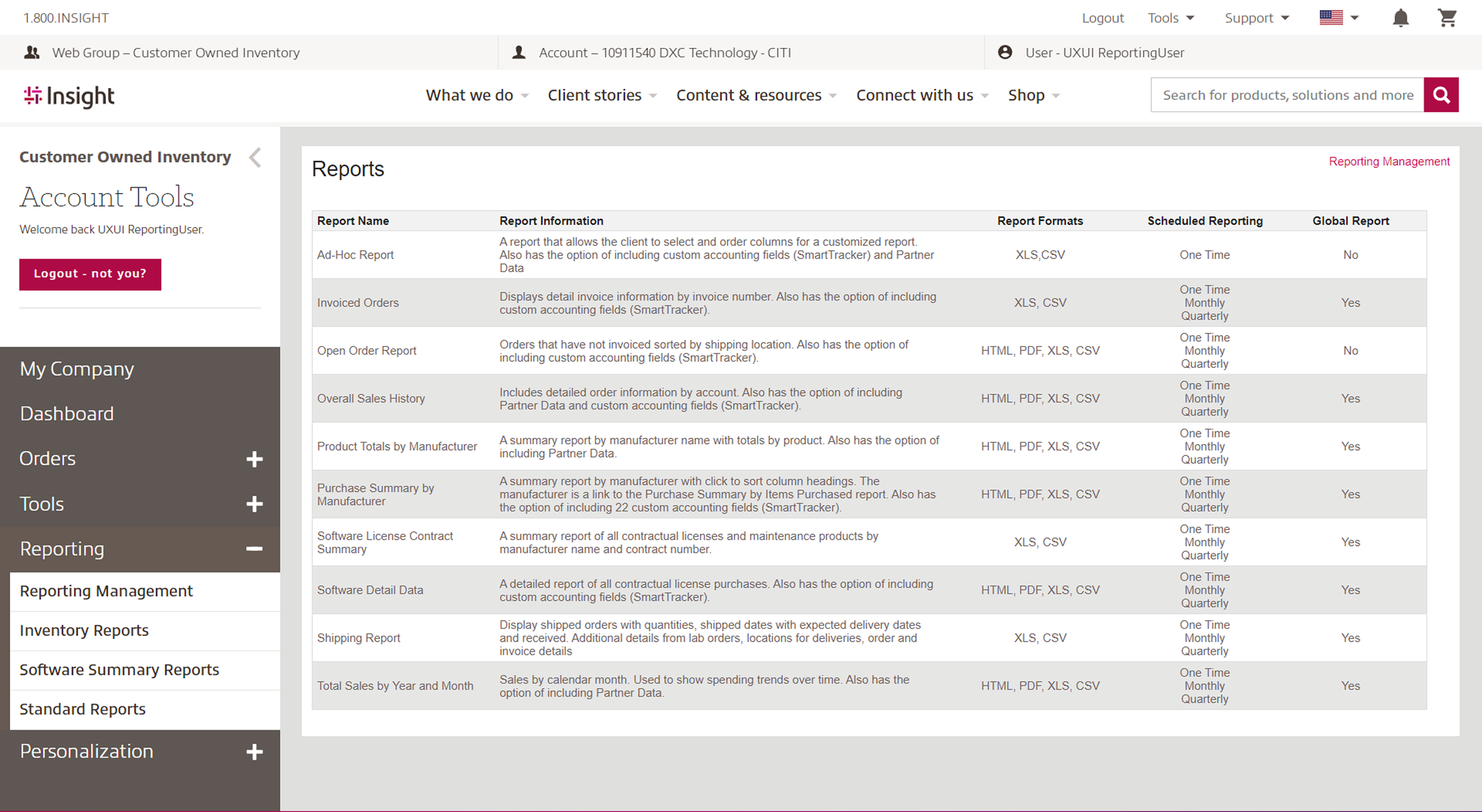
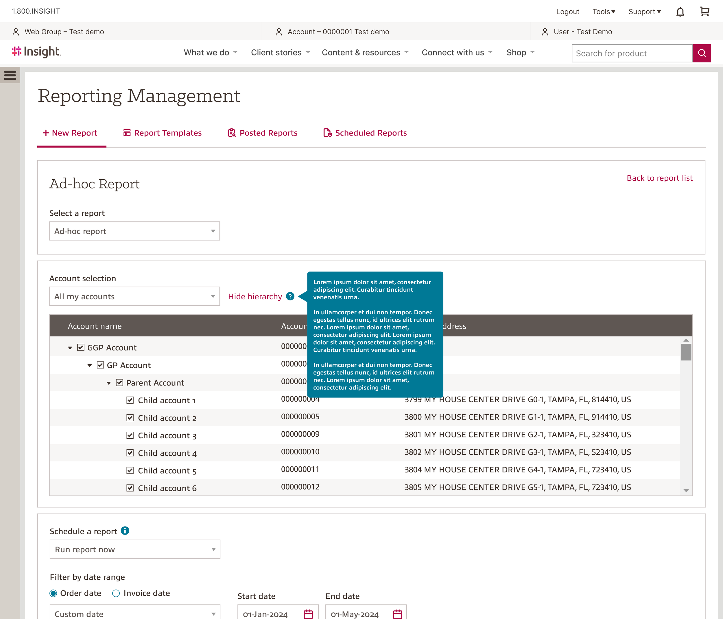
New Report
Simplified navigation with a unified top bar and clear tabs, and organized reports by category for better readability.
Added a dropdown for report explanations, reducing the need to switch between pages.
Removed clutter and duplicate paths to enhance focus and usability.
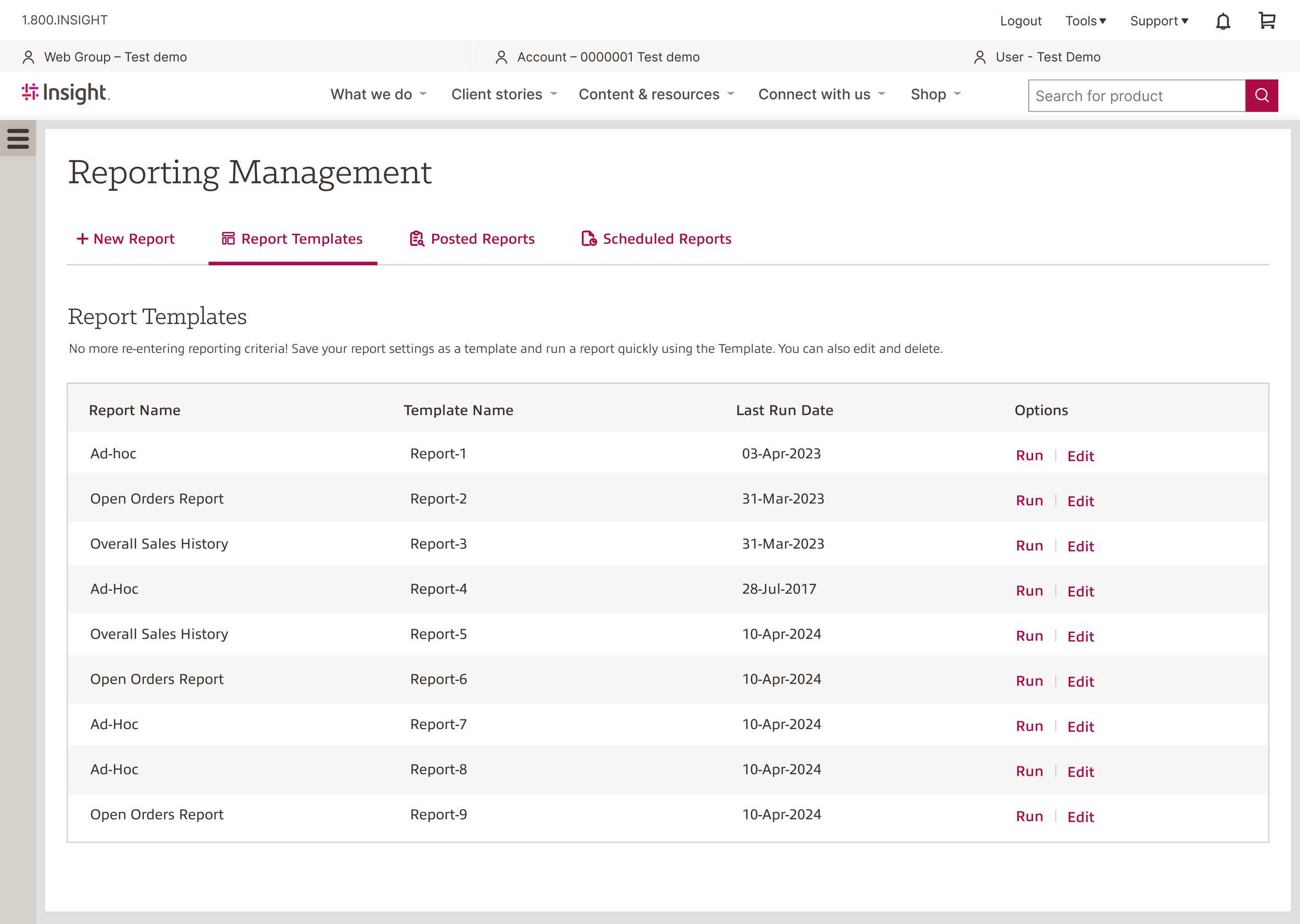
Report Template
The Report Templates section was moved to its own dedicated tab to reduce visual clutter and help users focus more easily.
The “Run” and “Edit” actions are now clearly separated into their own column, making them easier to locate and use.
The updated layout supports better scalability, allowing users to view more templates at once without feeling overwhelmed.
Orginal Version
New Version

Orginal Version
New Version
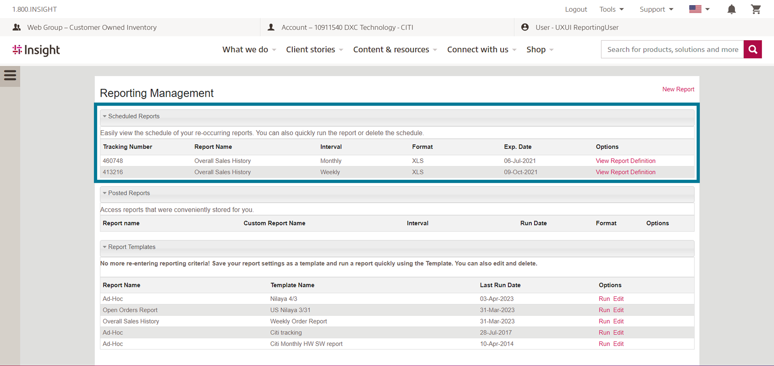
Scheduled Report
Applied a consistent layout to align with the overall report management experience.
Designed a clear empty state view to guide users when no scheduled reports are available.
Added a prominent “Schedule Report” button to help users easily understand how to get started.
Orginal Version
New Version
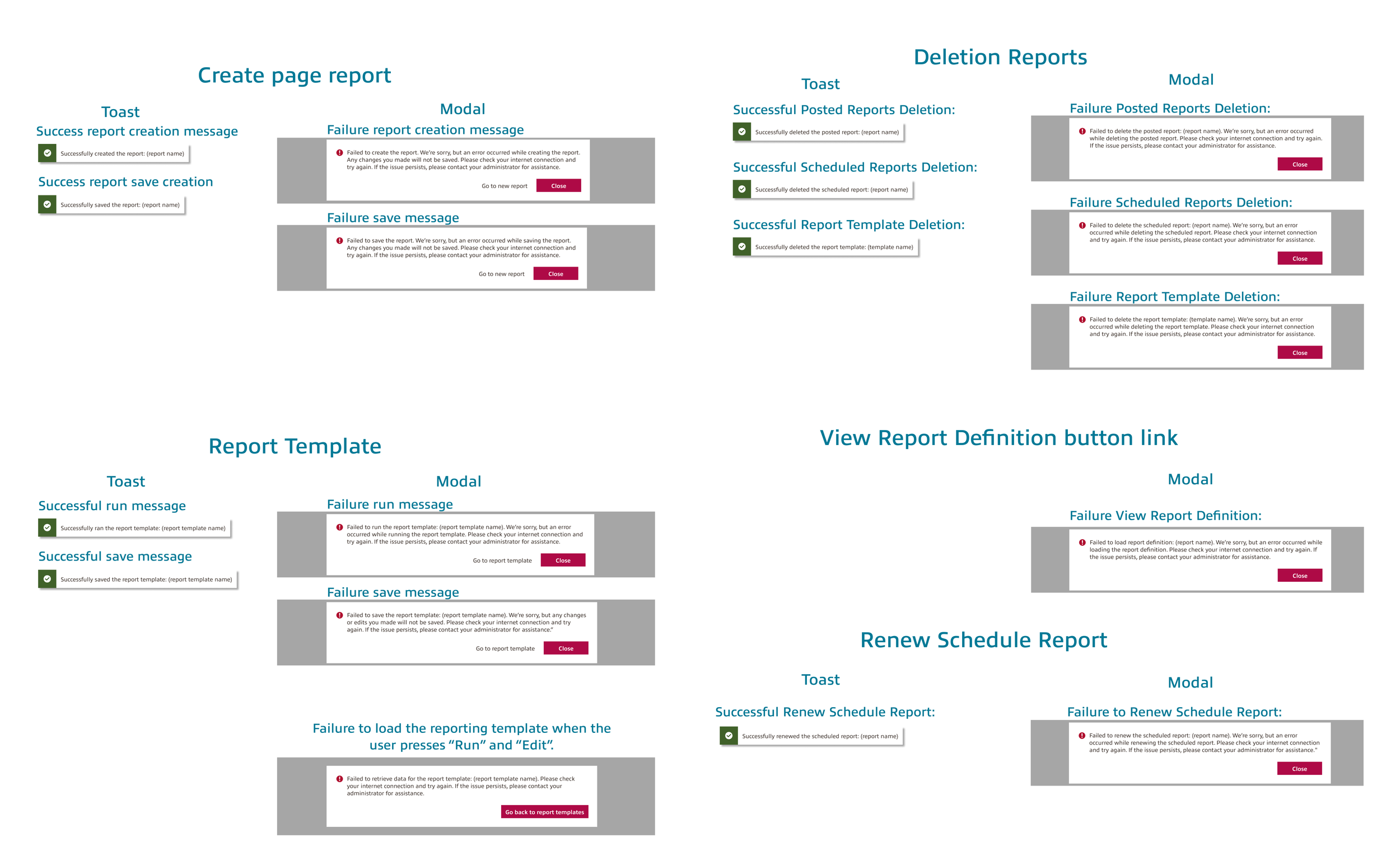
Confirmation Component
Created reusable components for confirmation interactions to maintain consistency.
Designed success message toasts to provide clear feedback after actions are completed.
Built standardized modals for scheduling and editing, making it easier for developers to implement across the tool.
Phase 5: Future Development
Report Generate
Postponed development of the report generation detail page due to time and team capacity constraints.
Next steps include unifying the design style across the platform for consistency.
Plan to redesign the report generation detail experience and validate entire experience improvements through A/B testing.
Orginal Version

New Version
Phase 6: Impact
Business Impact
Results in a 12% increase in usage,
Over 1,200+ reports generated compared to the previous year.
Team Impact
Personally, it was a fruitful moment for me to contribute to a collaborative effort. Sharing our research insights on the visualized prototypes, we were able to expedite our process by reducing communication loss. Although it wasn't easy to take on this role independently, it was enlightening to see this phase adopted as a formal process in following projects.