Redesign Cloud Dashboard
Redesigned the Cloud platform dashboard to enhance user satisfaction and accessibility by introducing personalized marketing content and user-driven notifications. Based on feedback and usage data, the new design improved engagement and led to a 5% increase in conversions. In March 2025, we successfully onboarded AWS as a new vendor, establishing a strong collaboration that expanded our service offerings and aligned with evolving customer needs.
UX Product Designer
I helped lead the design team through problem discovery, user needs identification, UX strategy development, rapid iterations, and A/B testing to shape a solution that addressed both user and business goals.
Role
To B, Marketplace Platform, System Design, Fast iteration
+4% revenue
Integrated AWS to expand service offerings and flexibility
Impact
Project manager, Product Owner UX designers, Developers
Our team worked closely with stakeholders, including Q&A, the architect, and software engineers.
Team
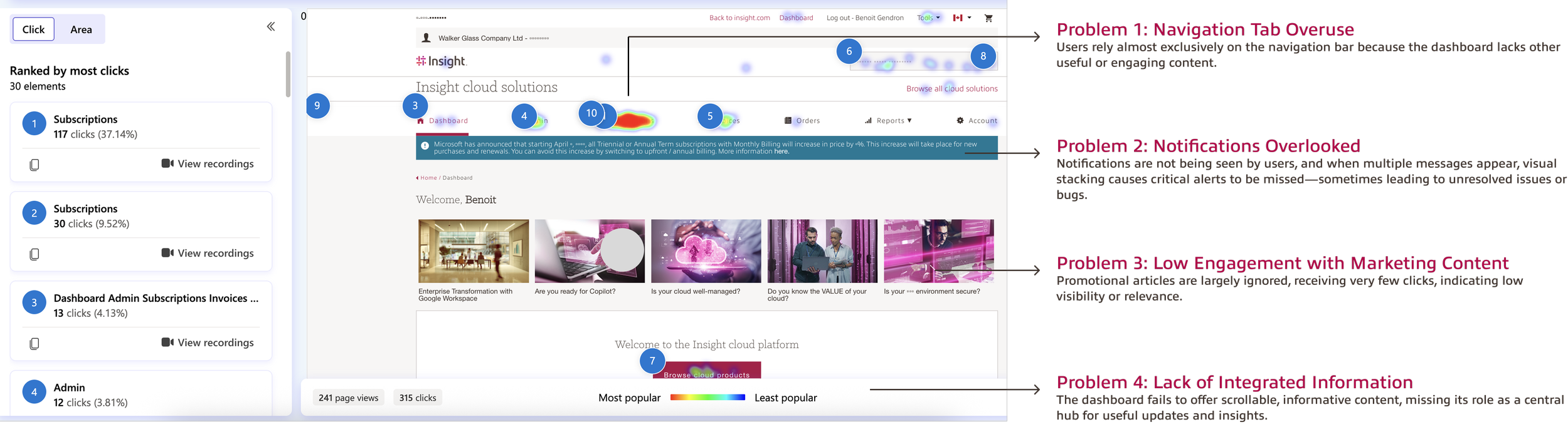
Through weekly reviews using Microsoft Clarity and heatmap analysis, we found that users weren’t scrolling or engaging with the dashboard, leaving valuable space underutilized. As the main landing page, the dashboard lacked clarity, didn’t display key content effectively, and had no dedicated area for important notifications, leading to user complaints and missed communication opportunities.
Problem: High Traffic, Low Engagement
The dashboard needed to display a wide range of information, making prioritization difficult.
Multiple cross-functional teams were involved, each with different goals and requirements.
Aligning internal stakeholders while keeping the end-user experience at the center was critical.
We had to deeply consider what users actually needed and expected from the dashboard.
Challenge:
What is the Cloud Platform?
The Cloud Platform is a B2B SaaS e-commerce marketplace that enables businesses to purchase, manage, and scale software solutions from leading vendors like Microsoft, Adobe, AWS, and Google. It offers services including Adobe VIP Marketplace, AWS Marketplace, Microsoft Azure Marketplace, Microsoft CSP, and Insight Packaged Services—all designed to streamline software procurement and cloud service management.
Background
Solution:
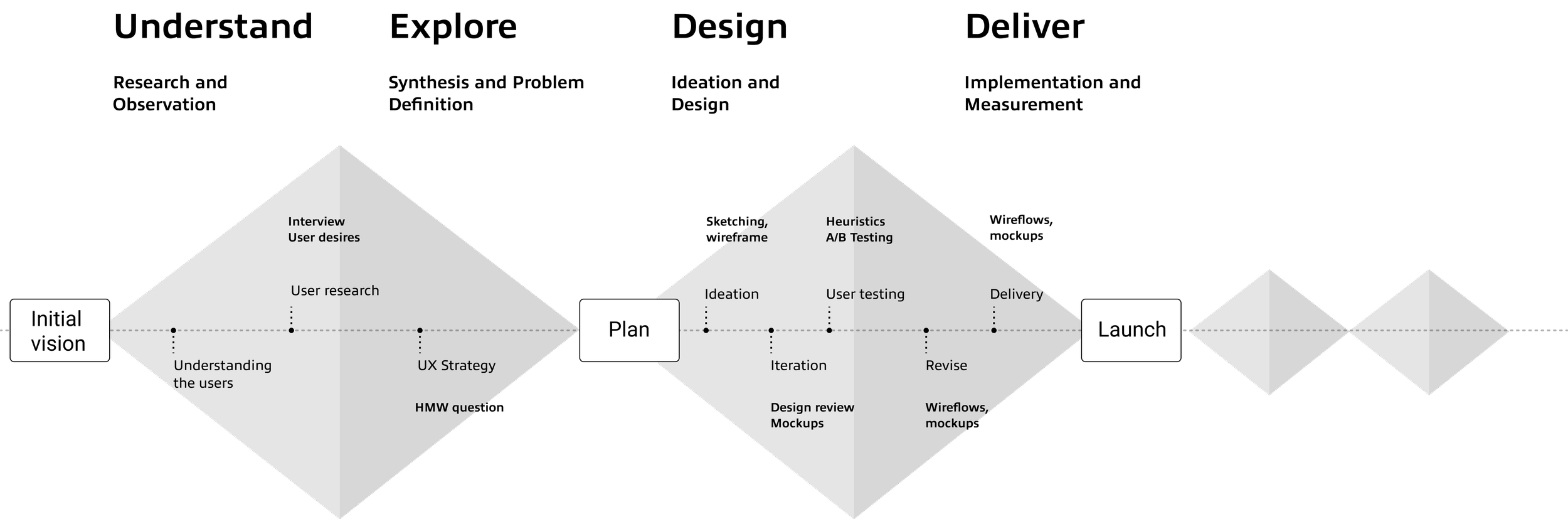
Design Process
ASM Users (Internal Support Team)
Internal team members who access the platform to support customers, troubleshoot issues, and manage service-related tasks.Resellers
Partners who manage multiple end-user accounts. They are responsible for purchasing, provisioning, and overseeing software and services on behalf of their clients.End Users
Direct customers who use the platform to purchase, manage, and track their own software and hardware products.
1. Needing a clear view of account issues
Who are the stakeholders?
User Desires
Phase 1: Understand
"When I log in, I just want to quickly know what's wrong and how to fix it."
– ASM user (Male, 40s)
ASM users need straightforward alerts and notices upon login to quickly assess account issues and provide effective support.
We conducted 1:1 interviews with each user group to understand their needs, capturing insights on sticky notes to visualize and prioritize key dashboard features.
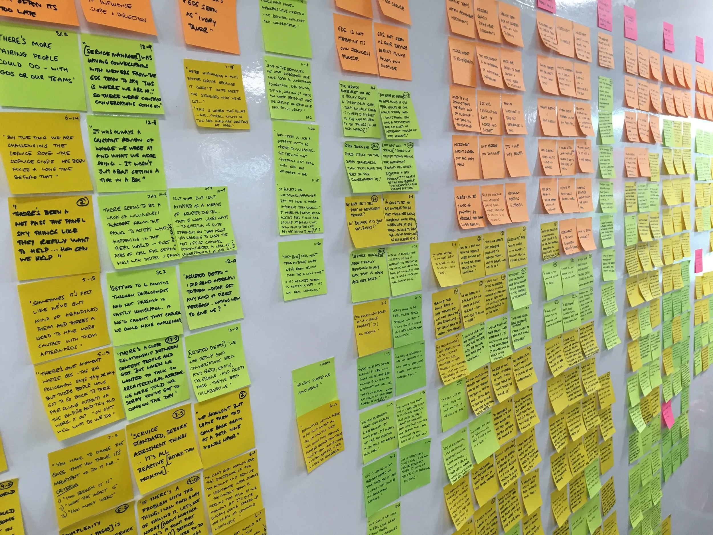
User research
2. Staying informed about system updates and releases
Resellers require timely updates on system changes, terms & conditions, and product releases to make strategic decisions and support their end-users effectively.
"If something changes—like pricing or terms—I need to know first. It directly affects my customers."
– Reseller (Male, 38)
3. Finding help and services more easily
End-users often struggle to locate support options and available services. They want prominent access to "Contact Us" and visibility into migration or management services.
"Sometimes I just need help, but I don’t know where to go on the site."
– End-user (Female, 45)
Phase 2: Explore
UX Strategy
Structured Value, Higher Engagement
We view the dashboard as more than just an entry screen—it’s a central hub that empowers users with a clear overview of their account. Whether they need to quickly understand their current status, take action, or seek support, the dashboard is designed to surface the right information at the right time, and to serve as a reliable place users can always return to for guidance and help.
HMW Question
How might we transform the dashboard into a meaningful and engaging entry point that serves the diverse needs of all our users?
Phase 3: Design/ Fast Iteration
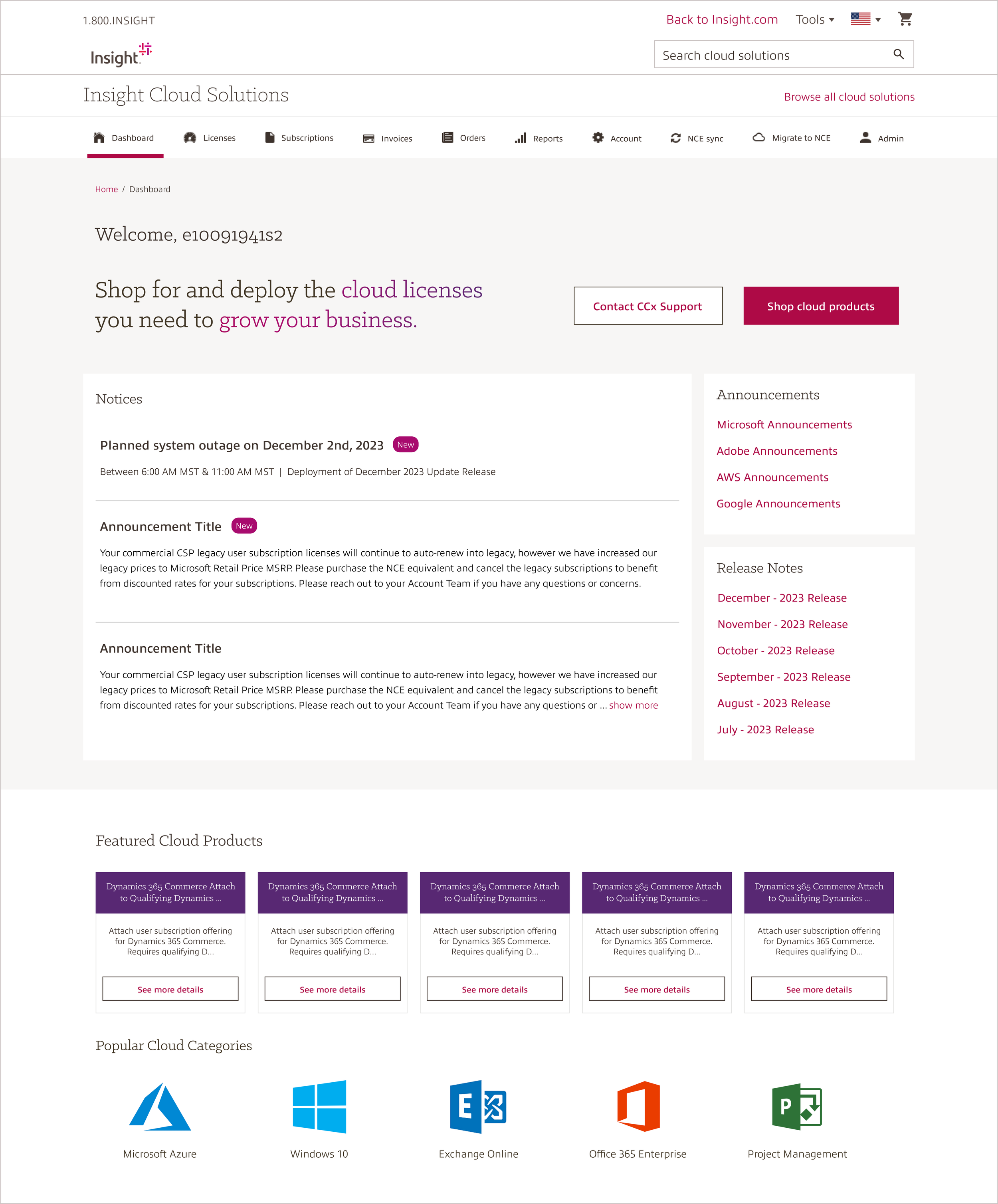
Version 1 with PO/PM & Marketing team
We began with a rough concept and quickly put together a low-fidelity prototype—not the prettiest, but it helped us visualize ideas and facilitate clearer communication during early design reviews with cross-functional teams.
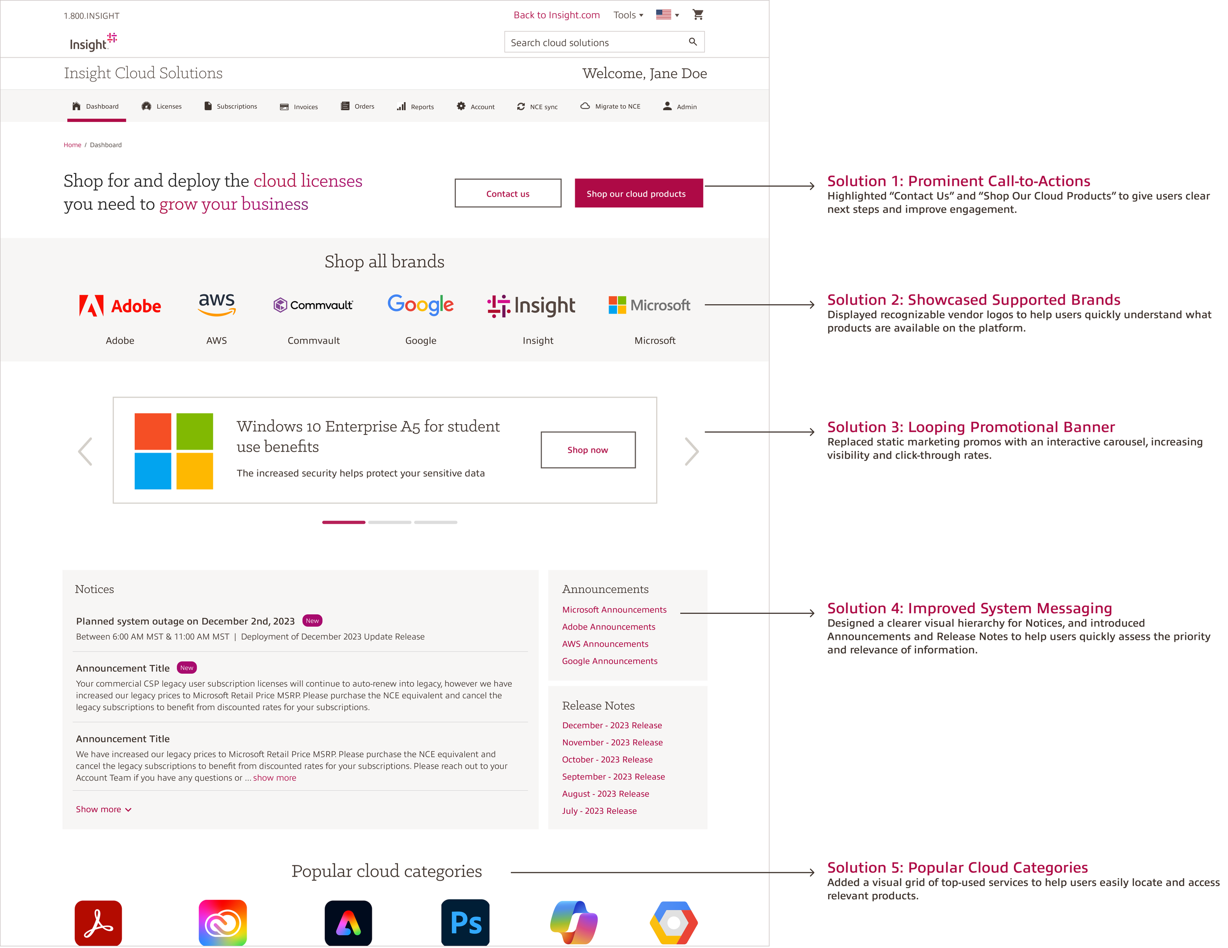
Based on early user insights, our initial prototype focused on clarity and accessibility by introducing:
“Contact CCX Support” button – to help end-users quickly reach support.
Notices, Announcements, and Release Notes – to keep resellers informed of important updates and changes.
Pillar-based content categories – to organize key information and improve navigation for all user types.
Team Feedback:
Requested looping promotional content to highlight marketing campaigns.
Flagged that “Popular Cloud Categories” lacked visibility and needed clearer placement.
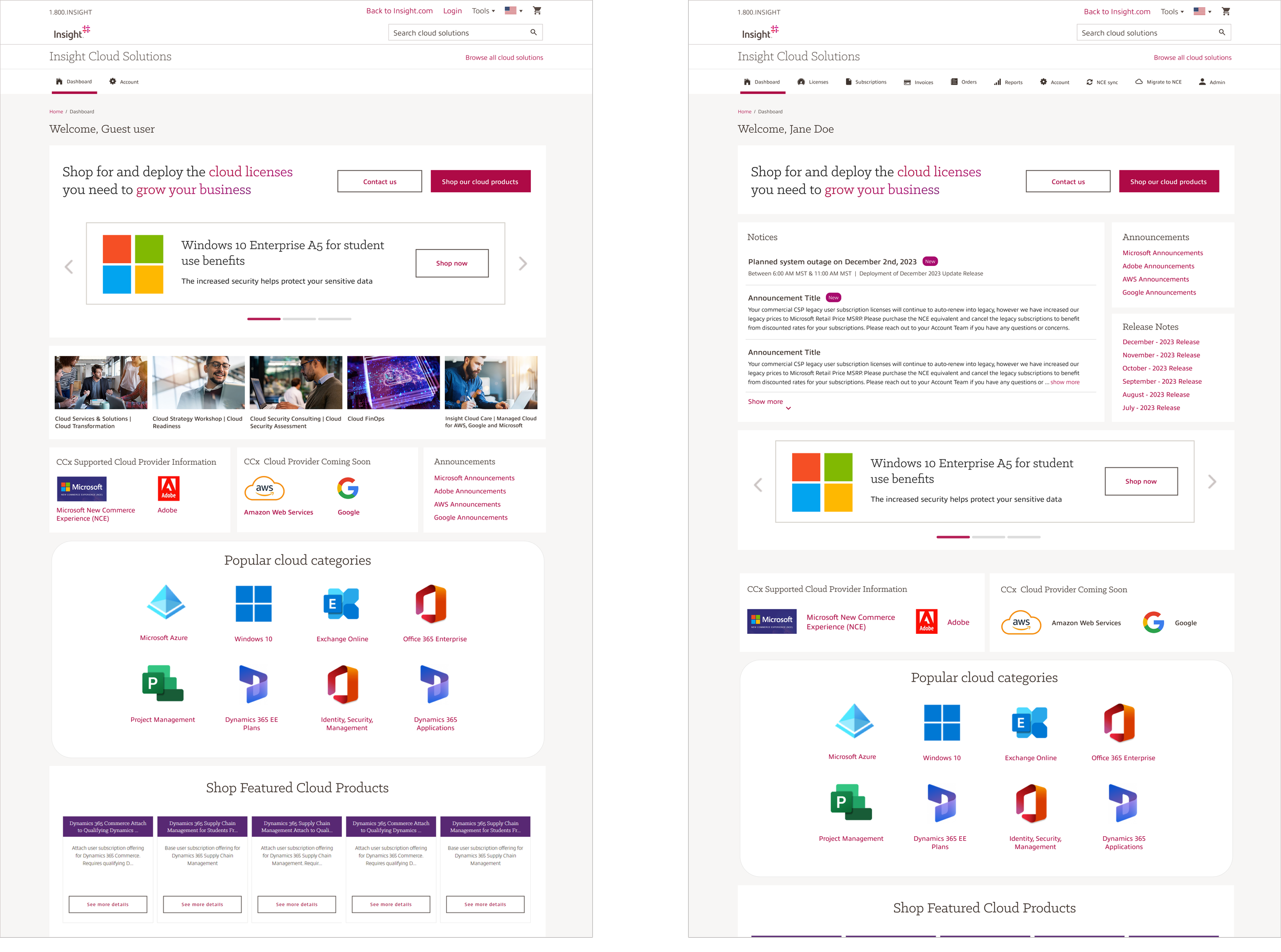
Version 2 with Business Team
After launching Version 1, we continued refining the dashboard with the business team’s feedback. While the design was still early and visually unpolished, we focused on surfacing key business priorities:
Added looping promotional content – to highlight ongoing campaigns and services.
Improved visibility of “Popular Cloud Categories” – making featured cloud products easier to find.
Continued collaboration with the business team to gather deeper input and align with strategic goals.
Team Feedback:
Showcase Vendor Information
To help customers quickly recognize which brands and products we support, the business team suggested highlighting vendor logos or names prominently.Plan for Guest User Experience
They emphasized the need to support a guest version of the dashboard in the future, allowing potential customers to explore offerings without needing to log in.Positive Response to Style
The team appreciated the overall layout and visual direction, seeing potential in the clean and informative presentation.
A/B Testing
version A
Although we received valuable content feedback, we felt the design direction still needed refinement. To validate our assumptions, we conducted an A/B test using Adobe Analytics.
Version B
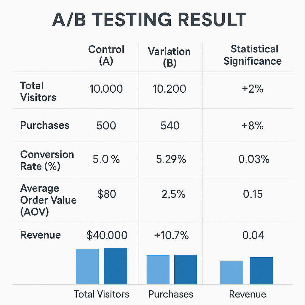
Testing Result
Due to NDA restrictions, I’m unable to share the actual A/B testing metrics. However, I created a representative version using a standard A/B testing scale to illustrate the outcome. In this case, Version B clearly resonated more with customers and showed stronger engagement.
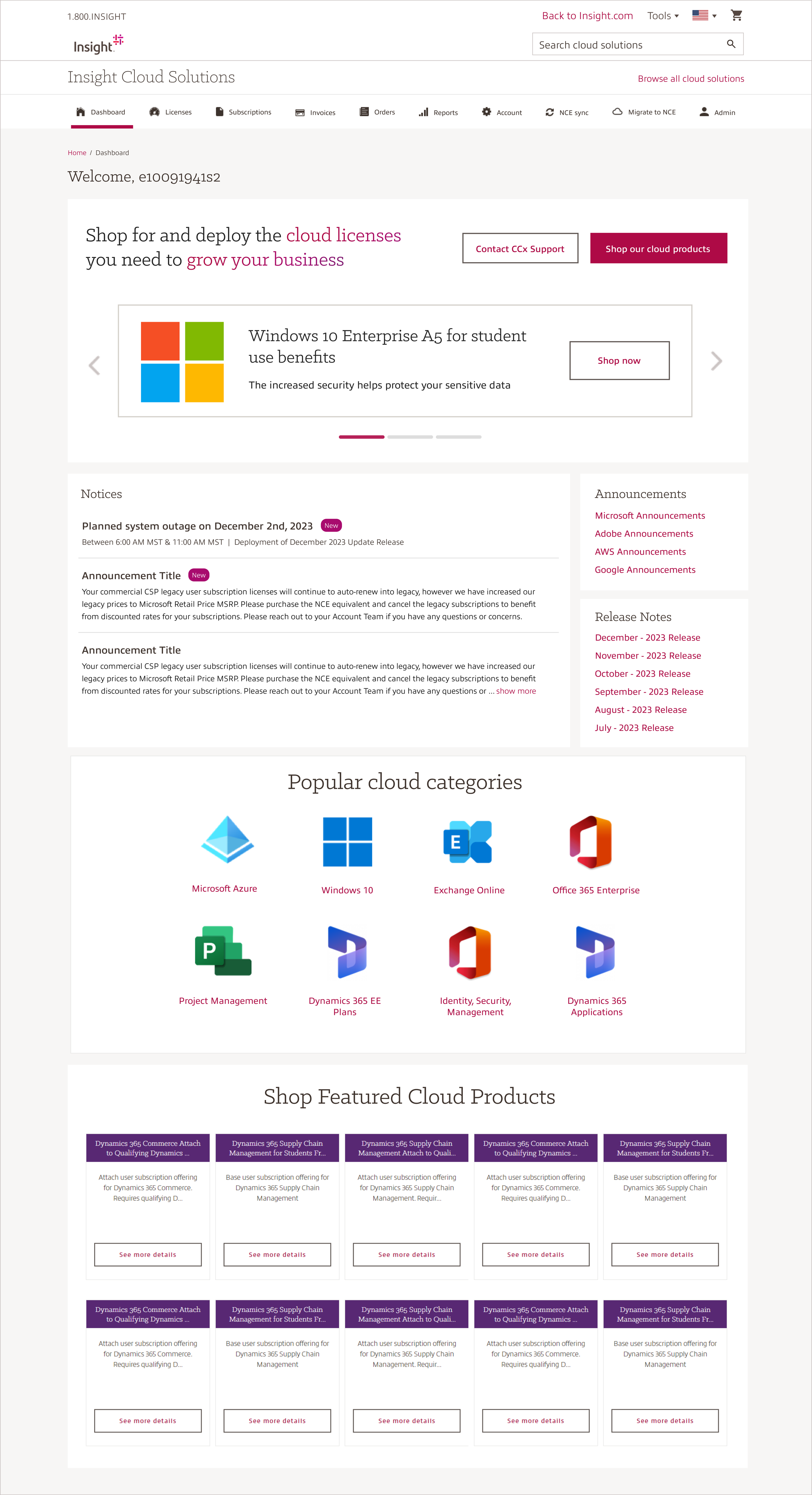
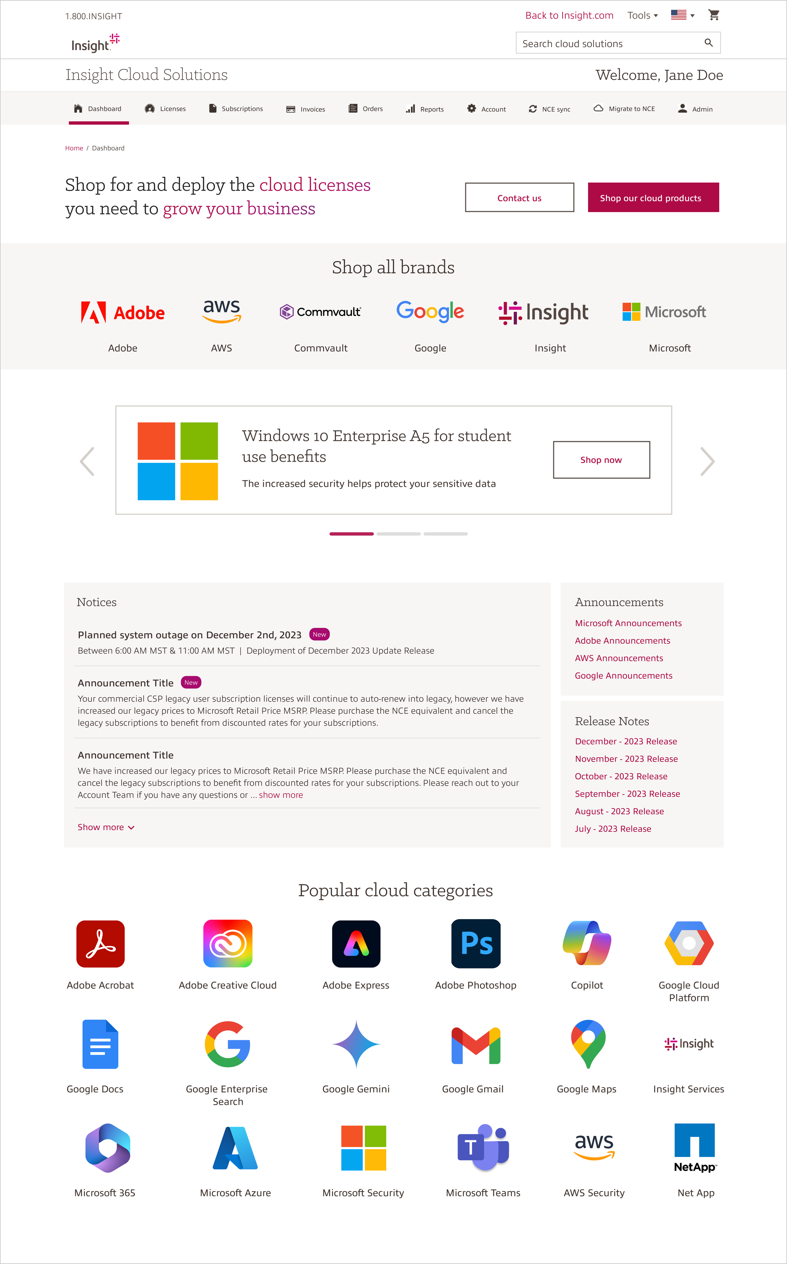
Phase 4: Final Delivery
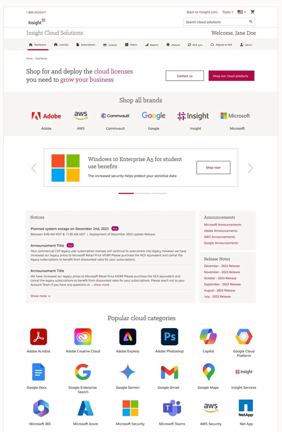
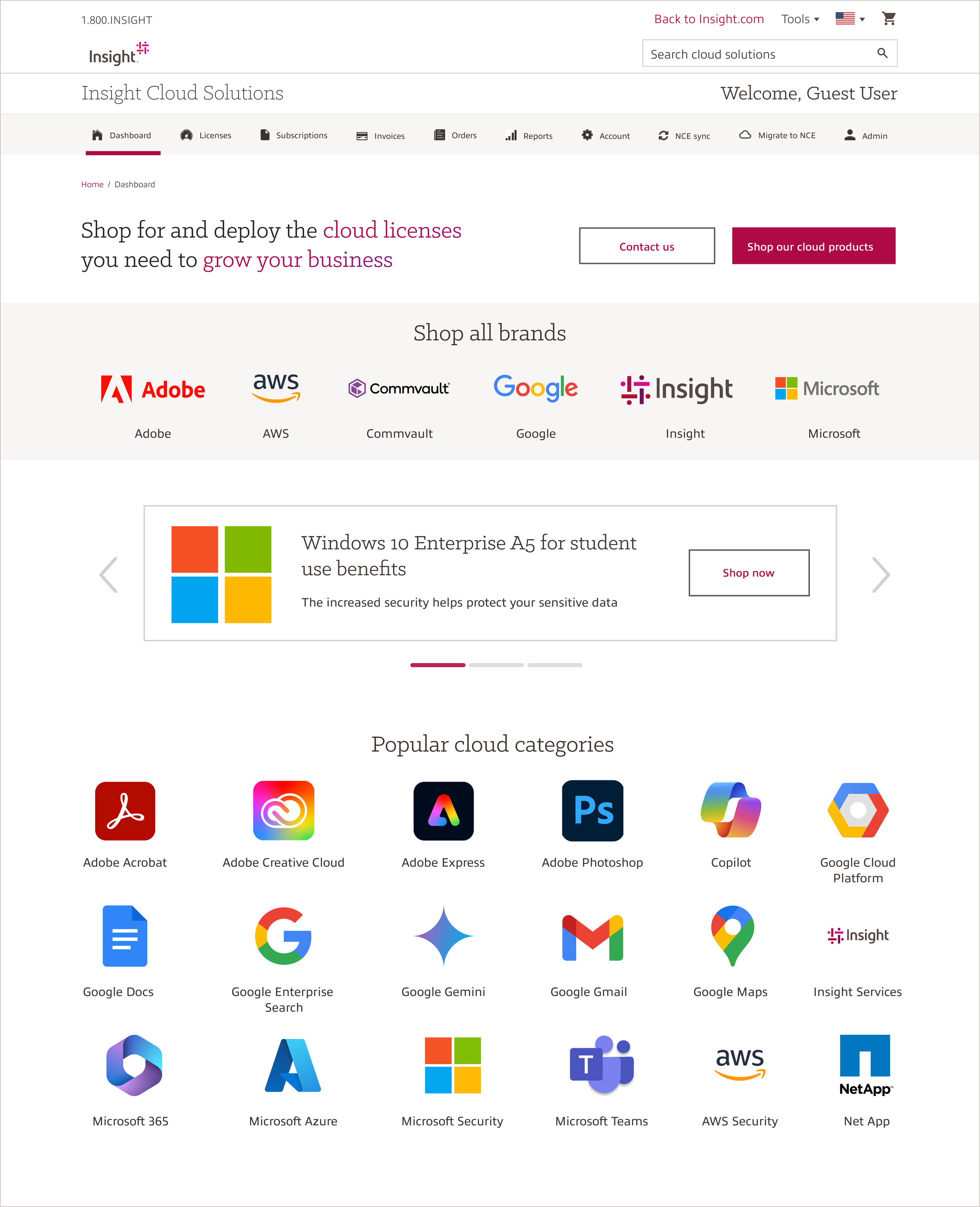
Authenticated users
Reduces friction and boosts conversions
Prominent CTAs (“Contact us” & “Shop our cloud products”)Instills trust and lowers bounce rates
Brand Carousel featuring Adobe, Google, Microsoft, Insight, and moreDrives click-throughs on key offers
Promotional Banner highlighting current deals and product benefitsSpeeds up discovery and engagement
Popular Cloud Categories Grid with top-used services at a glanceKeeps guests focused and on-site longer
Minimal Distractions—streamlined layout for first-time or casual visitors
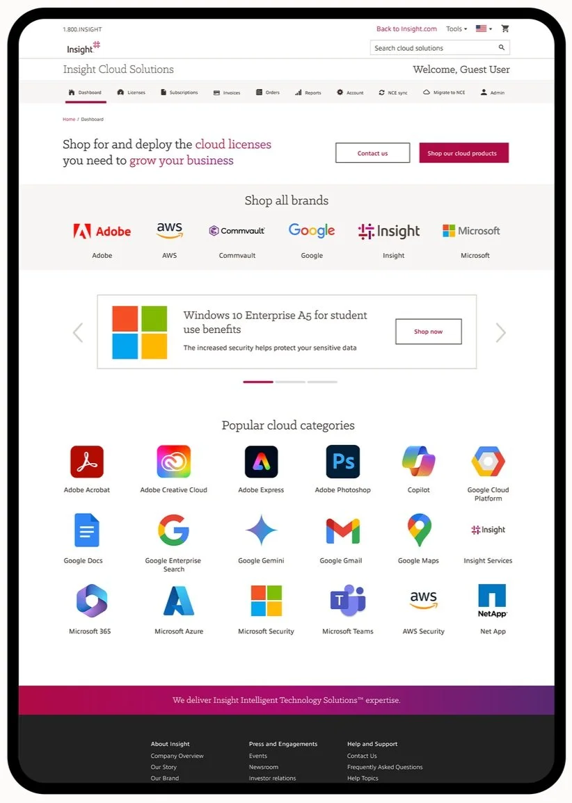
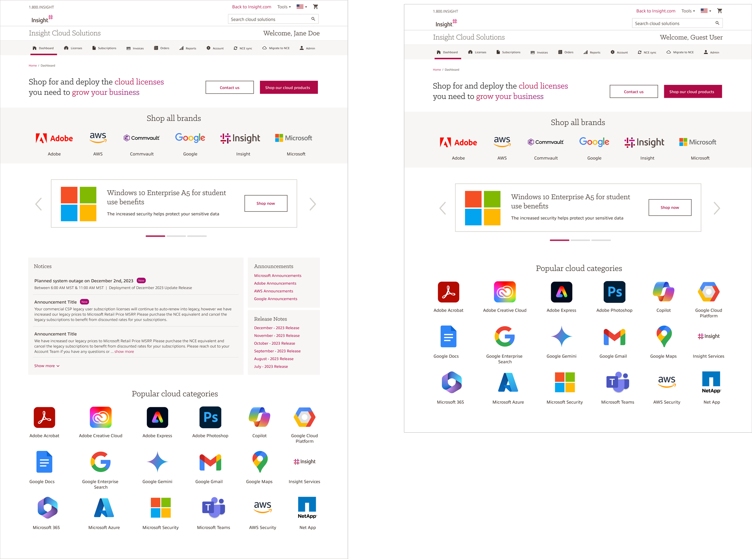
Guest User
Encourages Exploration Without Commitment
Guests can immediately browse products and support options—no login required—lowering the barrier to entry and capturing casual visitors.Builds Brand Trust Early
Prominent vendor logos and hero promotions reassure first-time visitors that they’re in the right place, increasing confidence and time on site.Highlights Conversion Opportunities
Clear “Contact us” and “Shop our cloud products” CTAs guide guests toward meaningful actions—driving leads and purchases even before account creation.Informs Personalized Onboarding
Tracking where guests click and what they view lays the groundwork for tailored sign-up flows and targeted content once they register.
Phase 6: Impact
Business Impact
+4% revenue increase
Integrated AWS to expand service offerings and flexibility
Team Impact
By leveraging regular design reviews, rapid prototyping, and data from heatmaps and A/B tests, our cross-functional team—UX, marketing, and business—moved quickly from insight to iteration, secured stronger stakeholder buy-in with clear visual artifacts, and built a shared sense of ownership around delivering measurable improvements.